Monday I shared with you pictures of the first level of the Elle Decor Showhouse in San Francisco that I attended on Saturday. (Check it out here if you missed it.) The stately 5,000 square foot mansion built in 1911 was renovated from top to bottom and showcases the talent of several local, award winning interior designers. The second level of the home far exceeded my expectations! Here's a few of the highlights;
As you walk up the staircase you can't help but notice this stunning chandelier. The clean, modern look that was present in the hallways and staircase is carried throughout the house, including the upper level. Here you can also see a glimpse of the burnt color silk wall covering used in this space. The look and feel of this wall treatment was very glamorous!
These fun, but slightly industrial light fixtures were placed in the upper hallway.
The girls bedroom designed by Grant K. Gibson was even more fun than I expected! I had been anxiously anticipating seeing this room in person and I wasn't let down! (I blogged about it here before attending the showhouse.) The opulent, handpainted DeGournay wallpaper was absolutely GORGEOUS! I love all of the trendy, preppy details used in the space.
Can I be 11 all over again and move right in?!
The adjoining bathroom in the girls room was complete with lipstick writing on the mirror and girly accessories scattered on top of the pedestal sink. The thought and details that were put into this bedroom suite were spot on!
I LOVE this Simple Scallop Pendant by Circa Lighting that hung in this small bathroom. If you hadn't noticed already, this showhouse didn't disappoint in the lighting department!
The guest bedroom again had an jaw dropping light fixture which I feel really made the room. The designer of this space, Elizabeth Martin was there on Saturday to speak with visitors about the room and her design. Unfortunately it was so busy and jam packed with bodies that I could barely get my head in the door to peak at the room let alone talk to her.
The second guest room designed by Suzanne Tucker was very serene with it's pale blue and green color pallet complete with beachy accents such as the coral lamp and striped rug.
Of course the lovely striped rug is by Dash & Albert!
A 1940's Parzinger chest of drawers is placed opposite of the bed.
This femeinine, ruffely mirror that hung above the dresser is one of my favorite elements in this space.
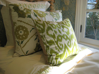
The lime green ikat and suzani pillows by Madeline Weinrib had me swooning in delight!
I adore this white lacquered bedside table by Bungalow 5!
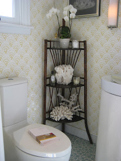
The adjoining bathroom complimented the bedroom nicely and featured a sink softened with a custom pleated skirt.
The tile in this bathroom is so fun! It's gray blue color and circular pattern make this otherwise traditional space feel a bit modern.
The upstairs bathroom showcased more amazing tile and cabinetry work.
The upstairs also featured a small but functional office space with retro wire lounge chairs and a saturated, jewel tone color pallet. It was a cozy nook I could see myself curling up in with a good book! The chairs were suprisingly comfortable (of course I had to test them out!)
The Master Bedroom, designed by Jay Jeffers is reminiscent of an elegant hotel room and features a subdued color pallet of shimmery silvers and taupes. It is nothing like what I expected, as most of Jay's work is typically more colorful but I was delightfully surprised to say the least!
Of course color is thrown into the room in small doses, like in this pair teal upholstered seat benches.
The common theme present throughout this entire suite would have to be the geometric pattern that is present in so many different elements from the fabrics and the ceiling treatment to the bathroom tile pattern.
Since the fireplace and windows are the focal point of the Master Bedroom, the wall that the bed is against is flanked by the entrance door and the closet door. I thought the brass and glass bedside tables combined with hanging sconces were a clever way to maximize the space.
Once again you see the geometric patterns present in the room by means of this awesome, upholstered ottoman in the seating area.
This mirror and console table combination is so unexpected but somehow it works very well in the room. I love the punch that the gold thorny mirror adds against the metallic Phillip Jefferies grass cloth wallpaper.
The Master Bathroom complimented the suite nicely with the same subdued color pallet and geometric patterns. I loved the wall mounted Kohler fixtures and Anne Saks tile.
As you can see, the second level of this magnificent home really knocked my socks off! Make sure to check back early next week and I'll share with you the lower level of the home!
p.s. Only five days left to enter the pillow giveaway! Go here if you haven't done so already!
images via Mary Jackson, bedesignobsessed, and sfgirlbybay


