images via Martha Stewart, Centsational Girl, Pinterest, WeHeartIt, Pinterest, Martha Stewart, Pinterest, Pier One, Elements of Style, Pinterest, Centsational Girl
Saturday, December 31, 2011
The Countdown Begins!
When reflecting back, 2011 has been a HUGE year so far, personally, emotionally, professionally, mentally, and physically. It's been filled with all sorts of ups and downs, successes and failures, happy times and new chapters for me. 2011 has been a whirlwind rollercoaster of a year, to say the least! I'm looking forward to 2012 and the opportunity for a fresh new start. I haven't put together a resolution list just yet, but I have some ideas in the works. . . I really can't believe the holiday season has come and gone so quickly and that it's already 2012 as of tomorrow. I'm spending this New Years Eve probably cuddled on the couch next to my husband and watching the ball drop on TV. Yes, I'm getting old and will admit that I am just looking forward to staying home, enjoying a nice dinner and some wine and vegging out. We are leaving for a big vacation in a few days (down to Southern California and Disneyland!) so we are just laying low for the holiday and prepping for our trip instead of going out. Do you have any big plans? Please share! I hope everyone has an awesome evening and a great start to the New Year! Cheers!!!
Friday, December 30, 2011
Red & Gray Color Combo
Red and gray is a unique color combination that I am seeing more and more of lately. Since gray has become the new 'neutral' in interior design, red is a great option for a coordinating color. Red is a stimulating color that evokes our senses while gray tends to be a more calming and relaxing hue. When you pair the two together, the juxtaposition is fabulous! Add in some pops of white and I am a huge fan of this color combo! Take a peak at a few examples of how these two colors look when paired together;
via Houzz
via Real Simple
via designdazzle.blogspot
via Etsy
via HGTV
via Color Sizzle
via Decorpad
via Pinterest
via Pinterest
What do you think about combining red and gray? Love it or hate it?!
Thursday, December 29, 2011
Eat-In Kitchens
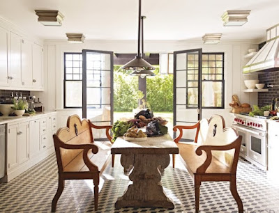
As much as I love a beautifully decorated formal dining room, lets be realistic. Typically most people only use their formal dining rooms every so often. Eat-in kitchens are pretty much a standard in homes now days because they are so realistic and convenient. Breakfast nooks, banquettes and islands are all great options for an eat-in kitchen, but what about incorporating a dining table with chairs right smack in the middle of the room? If you have a large enough kitchen, I think this is a great option! It's super functional and creates a cozy and inviting kitchen perfect for family dinners as well as entertaining! Here are some inspiring kitchens to inspire you!
via Windsor Smith
via Apartment Therapy
via Elle Interiors
via House & Home
via Traditional Home
via House Beautiful
via Elle Decor
via Windsor Smith
via Elle Decor
via Veranda
This layout might not suite everybody's fancy, but I love the look! What do you think about this style of eat-in kitchen?
Tuesday, December 27, 2011
Hallway Improvements
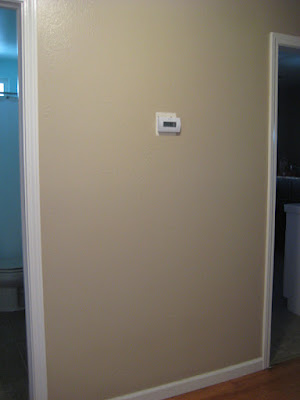
Right before Christmas I tackled a project around my house that I have been dying to get done for some time. . . the hallway! Take a look at the 'before';
This is the wall between the bathroom door and the doorway into the kitchen. As you can see, the thermostat is right smack in the middle making it a tricky spot to incorporate any wall decor. I decided a gallery style wall of pictures and art would be the best solution.
After we painted over the boring beige with a light and airy gray color I finally hung up some pictures and art, all framed in white. I used several pictures from our recent wedding as well as a couple pieces of art that we picked up while on our honeymoon. I also incorporated a wooden letter 'O' (since my new last name is Olvera.)
I created an art print with our wedding vows written on it and framed that in the upper left hand corner. Here's a closeup:
My sister purchased a custom piece of art from Etsy, framed it and gave it to us as a wedding gift. It's our names and wedding date written in the sand which is hanging in the bottom right hand corner.
Here's a close up of my favorite wedding picture which is framed and hanging in the center above the thermostat;
I also hung up the abalone shell that we used to hold our wedding bands during the ceremony;
The picture in the upper right hand corner was purchased in a surf shop in Santa Cruz while we were there for a week after the wedding. It's a shot of the iconic light house taken by a local artist.
So what do you think? I think the thermostat blends in now and isn't such an eye sore, which was my goal from the beginning. It wasn't my initial intentions to create a whole 'wedding wall' of pictures and art, but I love, love, love the way it turned out. Of course down the road if I tire of all the pictures I can change them out, or add to it, but for now I love having a wall of special reminders from our wedding day and honeymoon!
Saturday, December 24, 2011
Merry Christmas!
images via Tobi Fairley
I love Christmas decor that is COLORFUL, don't you?! This room decorated for the holiday season just brings a smile to my face. I hope I everyone has a wonderful Christmas filled with all the important things. . . spending time with loved ones, celebrating and lots of love! Feliz Navidad!
Friday, December 23, 2011
Yikes!!! It's Thursday (and the day before Christmas Eve) and I have barely posted on the blog this week. Time seems to get the best of us sometimes, doesn't it?! I hope you are enjoying all the great things that the holiday season has to offer, I know I sure am! Since I've been pretty vacant around here this week (and am pressed for time) I thought I would show you what I've been 'pinning' lately on Pinterest. Here's a collection of gorgeous interiors to feast your eyes on (and to give you a little break from all things holiday related!) Cheers!
To view image sources or to follow JPM Design on Pinterest, go here!
Subscribe to:
Comments (Atom)


