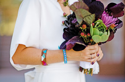
I was so inspired by this wedding I saw photos of over on Green Wedding Shoes yesterday that I thought I would share it here on the blog today. This casual and intimate wedding took place in Denver and had colorful and geometric design elements. You know how much I adore a laid back wedding (like my own last October) as well as my love for color, so this wedding just speaks volumes to me! Take a look at a few highlights.
Did you know in Colorado it is legal to marry yourselves? (As in no officiant.) I had no idea! To see more photos and read more about this fantastically colorful wedding, go here.
Showing posts with label Color. Show all posts
Showing posts with label Color. Show all posts
Wednesday, August 29, 2012
Tuesday, April 10, 2012
Electrifying Hot Pink!
Call me crazy but hot pink has definitely been on my design radar lately! This passionate hue is bold, eye catching and sure to leave an impression. It's not suited for the faint of heart, but if you have a hint of courage it can easily be incorporated into your home!
 |
| via Houzz |
 |
| via Haute Look |
 |
| via Style at Home |
What do you think of this hot hue?!
Saturday, March 17, 2012
Happy St. Patrick's Day! Ah, the color green. . . Today you will see it on everything from clothing to cupcakes to beer! The psychology of color tells us that green symbolizes growth, nature and money. It is also the color most associated with envy, good luck, generosity and fertility. It is the traditional color of peace and harmony and is found to be a very calming hue. Whatever your favorite shade of green is (forest green, kelly green, lime green, etc.) here is some inspiration for you to feast your eyes;
 |
| via Elle Decor |
 |
| via House Beautiful |
 |
| via unknown |
 |
| via Domino |
 |
| via House to Home |
 |
| via House Beautiful |
 |
| via Sunset |
 |
| via Coastal Living |
 |
| via Polyvore |
 |
| via House Beautiful |
 |
| via Martha Stewart |
 |
| via Pinterest |
 |
| via unknown |
 |
| via Pinterest |
 |
| via Apartment Therapy |
 |
| via Tobi Fairley |
 |
| via Design Sponge |
What's your favorite shade of green? Have a wonderful St. Patrick's Day!
Tuesday, March 13, 2012
Turquoise & Gray
We all know that gray has become the new 'neutral' color in interior decorating over the last few years. If you're not on the gray bandwagon yet, I'm pretty sure you will be soon. I love seeing gray paired with fresh and bright colors. . . especially turquoise! This color combo can be applied to chic and sophisticated spaces, or fun and whimsical rooms. It's definitely very versatile and looks great in many different applications. I myself love to see gray and turquoise paired with a pop of pink or yellow - so fun!! Here's some fantastic examples of this cool color combo;
 |
| via Alisa Burke |
 |
| via House of Turquoise |
 |
| via Houzz |
 |
| via unknown |
 |
| via House of Turquoise |
 |
| via 7th House on the Left |
 |
| via Urban Outfitters |
 |
| via Adore Home |
 |
| via Decorpad |
 |
| via House of Turquoise |
Tuesday, January 17, 2012
Trend Alert: Ombre
The french word 'ombre' literally means shadow or shaded. This trend has been popular in fashion for quite some time, but has recently been popping up everywhere in interiors. In design, it is gradation and shading of color (typically going from light to dark) on fabric, walls, furniture or any other surface. I adore this trend and it's probably because it reminds me of tie dye! Although it is a little more sophisticated than tie die, but striking none the less. Take a look of some examples of ombre;
via Urban Outfitters
 |
| via Martha Stewart |
 |
| via Making it Lovely |
 |
| via Pinterest |
 |
| via Martha Stewart Living |
 |
| via Pinterest |
So what do you think of the ombre trend? Love it or leave it?!
Subscribe to:
Posts (Atom)


